Sun map
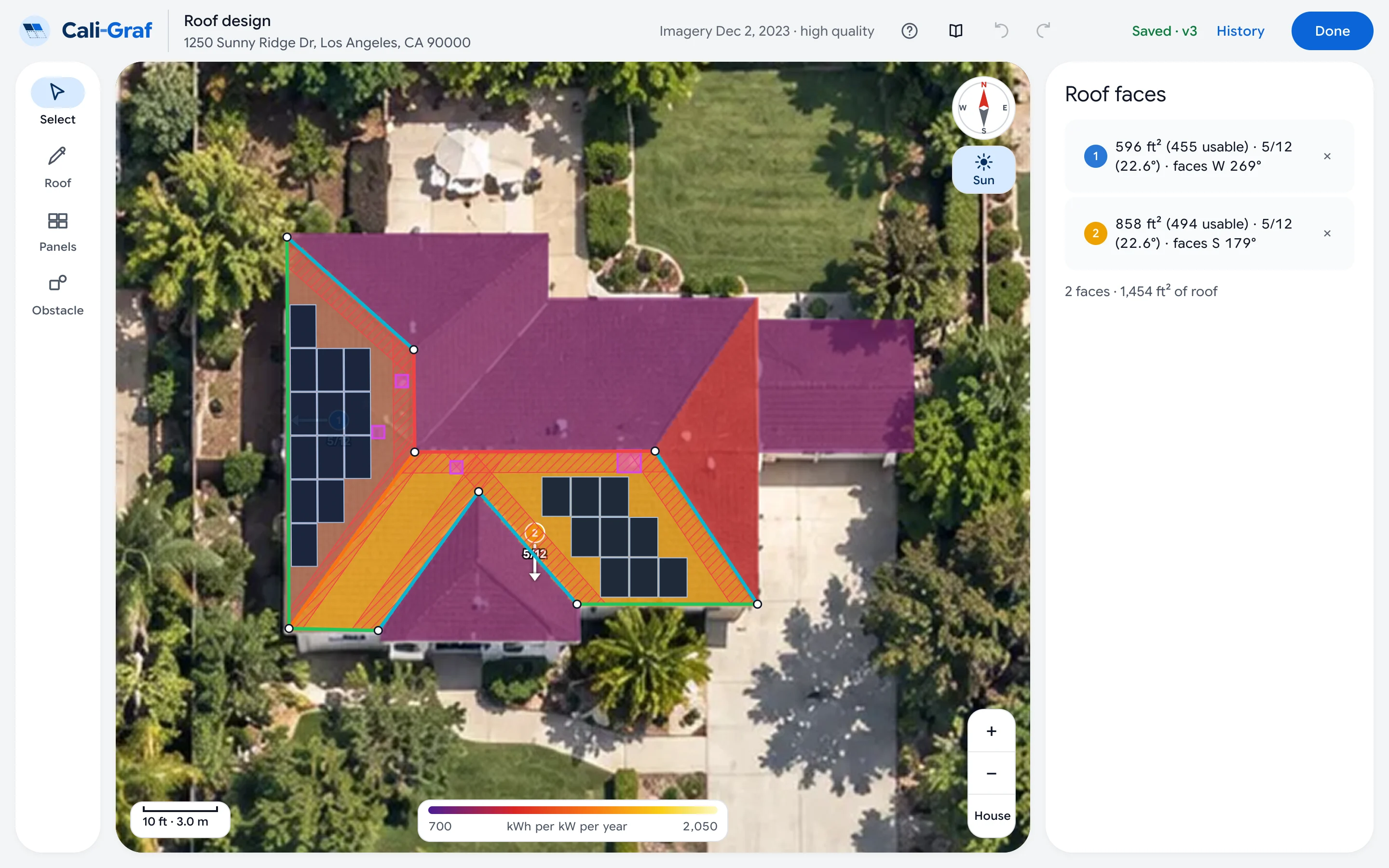
The sun map colors the roofs by how much sun they get in a year, shade from trees and neighbors included. Turn it on with Sun or the / key, and read each face’s number in its settings — the higher, the more power per panel.
Two faces with the same direction can be worlds apart if a tree shades one of them all afternoon. The sun map shows that at a glance.
Turn it on
Press Sun
The Sun button is at the top right of the image, under the compass; or press /. Press it again to turn it off.
Read the colors
The scale at the bottom of the image runs from about 700 to 2,050 kWh per kW per year: how much a kilowatt of panels would make at that spot in a year. Yellow is the sunniest; orange and red get less; purple is in shade or faces away from the sun.
The number for each face
Select a face: Sun on this face gives its average in kWh per kW of panels a year, shade included. Compare faces with it — and skip panels on parts of the roof that stay purple.
Where it comes from
Google Solar works out the yearly sun for every 10 cm of the roof from its height map and the weather, with the shade of trees, chimneys and neighbors. Cali-Graf’s own calculation is separate — it models every panel hour by hour — but the two agree on which spots are worth panels.
Was this helpful?
Thanks — it helps us make this page better.
Updated